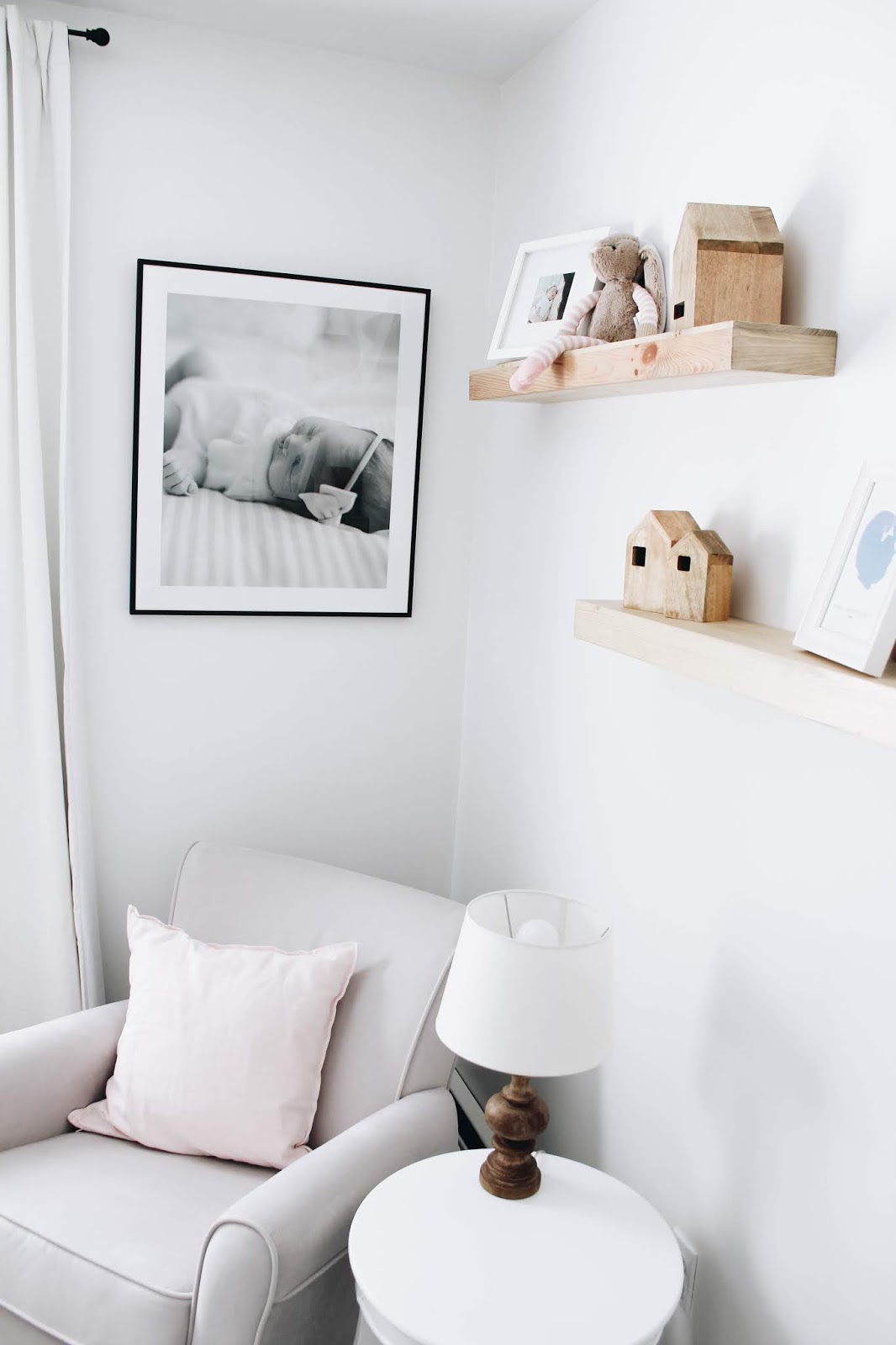
Another room has come together in the Hill house, and this time it's for our littlest lady. Her nursery is the quaintest little space, focusing on neutrals with pops of blush and sweet personal touches. I love sitting in her room to nurse, taking in all of the softness that fills the entire space. The morning light that streams through is my favorite, and I love the way it dances across the floor. It's all kinds of lovely.
This room came completely together on a budget. Almost all of the nursery is filled with furniture we already had, and it was my goal to weave it all together for a unified look. With a bit of creativity, I was able to curate an entirely different space for Quinn out of pieces that once made up Greer's nursery. I love that the furnishings our first baby used are now a part of new memories being made with her little sister.
In this small room simple was best to maintain airiness/brightness and keep it from feeling cluttered. The crib and the dresser, along with the curtains and the rocking chair, boast a serene feel, which we extended to the walls with white paint. I also kept to minimal patterns and colors to achieve my vision. Black frames, dresser knobs, and a curtain rod made for bold complements to the lighter tones, while still maintaining a feminine feel. To play into the neutral theme, I went with black & white art and photos for a timeless touch.
With lighter + neutral as the theme, I kept the decorative pieces for the wall just a tone darker to bring in a bit of variance while still being cohesive. The shelves and the DIY tobacco basket, along with the ottoman and toy chest are all in the same color family, and were perfect for bringing out the fabric on the sides of the crib. Slowly and surely, I built the room around the existing pieces we had, keeping my theme in mind and brining in new momentos for Quinn, one of which is the wooly ball mobile. It's delicate and perfect in its new cozy corner. The openness and size variation of the felt balls brings some added depth to that side of the nursery without making it feel over accessorized.
To contrast the subtle features, I pulled in a vibrant rug that we had but weren't sure where to use. The colors were the perfect way to bring in girly accents to a basically all-white room, really anchoring the space. From there, I found blush pillow covers to put on pillows I already owned, added dried pink flowers to a white vase, and Quinn's perfect little profile in a french blue. While the colors are minimal in her nursery, the use of them goes a long way to cozy everything right up!
One of my favorite parts of the room is the art and photos. Belle Botanica had the most perfect vintage botanical sketch prints, and I couldn't imagine the room without them. I love that the prints feel whimsical in her room now, but will easily grow with her.
And the large prints of my tiny newborn, her little feet and head full of dark hair, make this mama heart swell. There's something so classic about black & white photography, and I knew I wanted to use photos of her to make a personalized statement piece for her nursery. Mpix framed two of her newborn photos from our session with Ashely Powell Photography. And y'all, they could. not. be. more. perfect.
If you're looking for a rocking chair to fit into a small nursery that is not only comfortable, but also beautiful this Lancaster Rocker in linen is perfection. It's also spill resistant, which is a game changer when your baby is the queen of spitting up.
We're also super smitten (and thankful) for the amazing black-out curtains that keep the day's sunshine away during naps. I love that these curtains are so light-weight, but 100% capable of making the nursery totally dark. I can't recommend using black-out curtains in your little's room enough!
One piece of nursery décor I think every mama should incorporate is a silhouette of your little. I have one in Greer's room and now one in Quinn's. It's such a sweet way to document them in any given season. I always have Jordan from Postmark Studios make my girls' silhouettes.
S O U R C E S
Paint: Sherwin-Williams Snowbound
A very special thank you to the sponsors of this post:
Delta Children, Carousel Designs,
Belle Botanica, Wooly Sheep Dots, Postmark Studios, and Mpix!
**Affiliate links were used in this post. Thank you for supporting the blog!
Delta Children, Carousel Designs,
Belle Botanica, Wooly Sheep Dots, Postmark Studios, and Mpix!
**Affiliate links were used in this post. Thank you for supporting the blog!


Social Icons